

Some time ago now, I wrote a post about how I go about choosing colours when I’m making quilts, crochets and embroideries…I always find it easier to go back to basics, and to think about the primary and secondary colours before giving any thought to how and why some combinations work and how others are a bit hmmppphh rather than “wow”.

Often before I start a project I make a colour wheel from all the pieces of fabric using bits from the nearest scrap bag to hand…..with a couple of extra colours to the red,orange,yellow, green,blue,violet/purple…and that’s teal (bluey green) and pink…you wouldn’t normally get either one on a colour wheel as they’re tints (pink being made by adding white to red, teal being created by adding white to bluey green) but pink is a tint/colour I find that I use a lot and personally think it combines well with most other colours. I also like teal a lot as well.

(Pink and yellow is a pairing I find myself using time and time again, but I also like pink with green for my patchworking, embroidery and even my wardrobe)…
Thinking about it I like pink with just about every colour, about the only pink pairing I don’t like is with purple…..though orange can be a bit hmmm but it depends on the colour pink I use…..

I found by having a bit of a play emptying out a scrap bag or getting out a big selection of fat quarters* and making a colour wheel on the carpet, helps you to understand why certain combinations can look so good…it also helps you think about putting other colours together that you might not first think about.

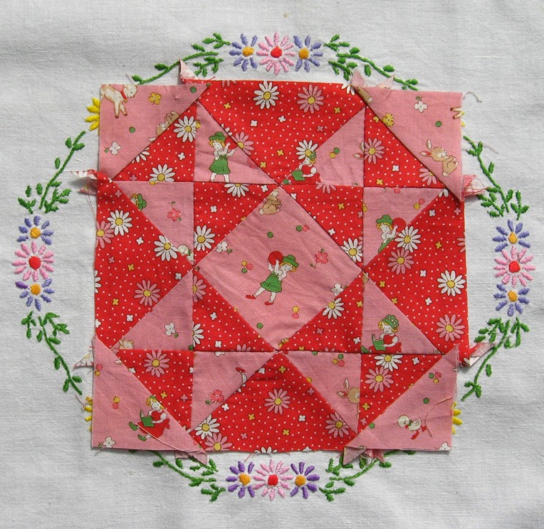
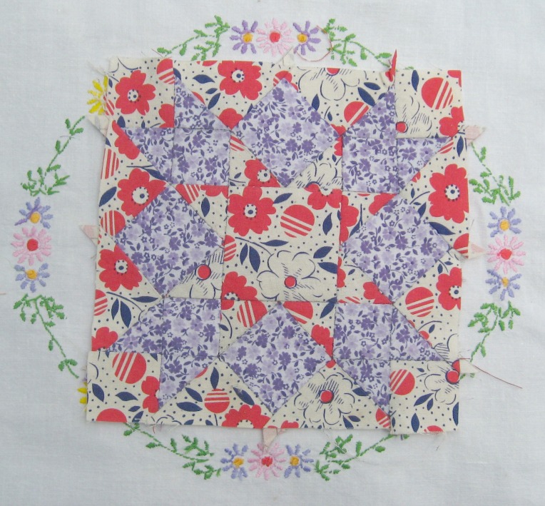
I also like working with shades of the same colour, especially where there’s lots of pattern in the fabric to compliment….the above block uses 3 different red prints….one is a bright lipstick red, one is a pinky red and one has red and pink together with highlights of blue…..while the pinks and reds used are different, they’re equal enough in tone to be pleasing to the eye…(if you took a black and white photocopy then the pinks would be one grey and the reds another)
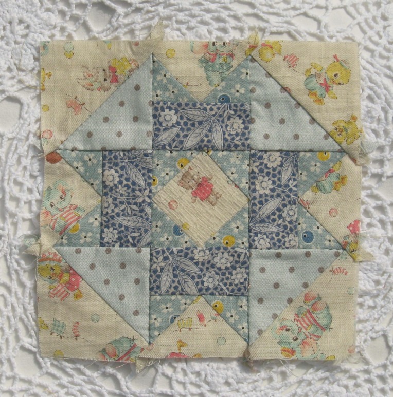
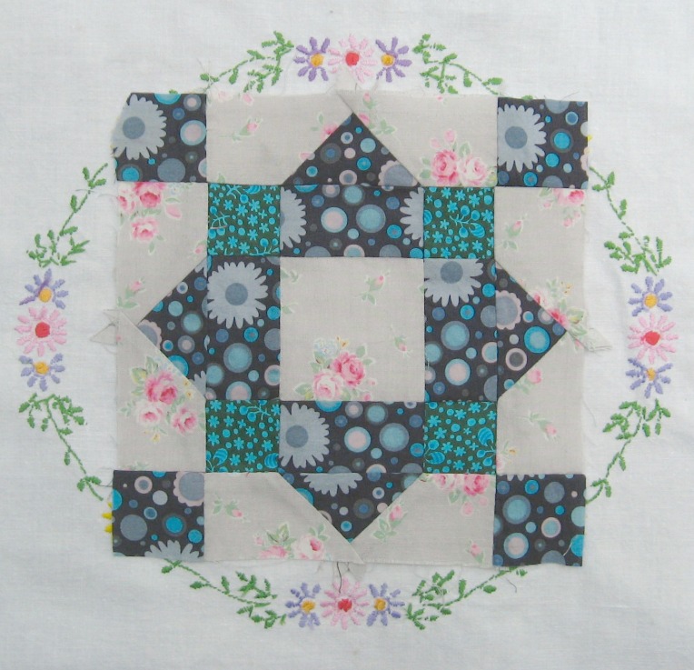
Another example of using shades of the same colour is this little block….4 different fabrics are used, 3 which are blue based (one dark and two mid tones) then the other fabric which although has blue and pink in it is a “white” colourway of the print…..all the fabrics used are prints rather than solid colours as I prefer to work with those and often pick up tiny dabs of colours from one print and then work to match that with a contrasting fabric.
Analogous colours are when you pick colours that sit next next to each other on a colour wheel (such as red and orange, blue and green, blue and purple)…. There’s no jarring when you use them together, and they’re generally pleasing to the eye.
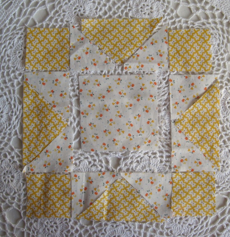
I tend to pick one stronger colour to be the main focus and then another to compliment it….the yellow print above is quite an intense colour, there are flecks of it in the floral print but the orange tulips are what the eye wants to focus on first.

You often find analogous colours together in nature which may be why they seem more restful to the eyes than colours that bounce off each other….(yellow and green daffodils or primroses…blue and green bluebell woods or forget me nots….)…when a blue and green look this stuning in real life then you know that when you pick these colours for embroidering or knitting or patchwork (or even a wardrobe choice) then that will look equally beautiful.
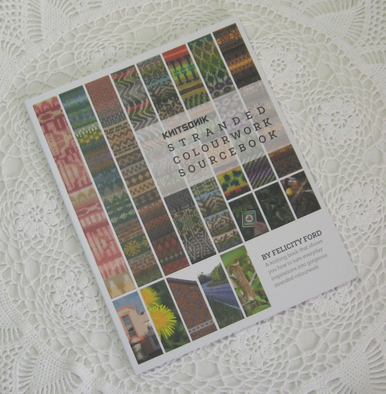
I’ve mentioned the Stranded Colourwork Sourcebook several times before on my blog and it’s such an excelllent reference book for understanding colour choices, looking at depth of colour, lights and dark, creating movement that is needed for knitting (but which I find essential for patchwork too)…..and while I’ve yet to create any stranded knitting yet of my own (also known as Fairisle knitting) I’ve found it an incredibly helpful book to read regarding how I pick and chose colours for my patchworks….as an inspirational starting point it’s so good….it’s not a random book of pretty pictures (though many are really beautiful) Felix can see the beauty in patches of tarmac on the road or in Victorian brickwork, everyday things that often are overlooked……it’s the enthusiasm and encouragment that are found within the pages along with the colour theory and thoughtfulness about colour choices that help make this such a great book.
I know from past experinces that if I’m making ice-creams or am out picking blackberries and scarlet coloured haws, the colours I see in my kitchen or in the hedgerows (which then stain my fingers) soon crop up in my fabric choices…

Sometimes my colour choices are suble, gentle tones that blend into one another… “the quilt police” would no doubt frown upon these as there’s not enough contrast, all light and no shade but I love that sun faded look these soft prints give…(generally speaking for a succesful patchwork, one where there’s a good overall balance, you do need plenty of contrast but time and time again I find myself favouring those lights…..and I’m never a great stickler to rules)
Other times the contrast is there both in tone and pattern…a mix of delicate floral print combined with bold brighter hues…..

I’ve not yet tried this with my knitting but I’ve enjoyed experimenting and playing with colour with my crochet…..I like using combining subtle shifts in colour and tone…..

…with swift changes that flitter back and forth…..
Some combinations aren’t always so succesful but they only take seconds to rip out and start again…
A little exercise I find quite useful to do is to paint up a series of the same block (something simple like a churn dash or star), trying out one colour (or tint) with all the others……pink with red, green, blue, grey, orange and so on….different blues with purple,green,yellow,grey…..some you’ll love, some you’ll hate but I’m sure you’ll see some that you hadn’t thought would look all that but which are a very pleasant surprise….
*you could of course use wool, embroidery threads, tapestry wool but you might want to put a clean sheet down first as those tend to pick up carpet fluff a lot more than fabric.

I have enjoyed what you do with colour. Being an artist I am familiar with the colour wheel and have been working on the granny paperweights with all the tapestry yarn I have. I also like Sophie Digard’s colours for her crochet, which have a faded look. Thanks for this. It is really useful!
I will keep this post as a point of reference for many a project. I need to! Whenever I choose colour combo they seem so right in my head but they don’t sit well in reality. I also have the big problem that one day i love brights, the next next it’s naturals then its more muted colours. Aaarrgghhh!
I’m just the same, I’ve got a hoard of fabric for two quilts which I spent a couple of years buying (I couldn’t afford to buy it all in one go) and now some twelve or thirteen years later I’m not so sure of those colours or quilts….one quilt was supposed to be a log cabin quilt all in red, the other was going to be a star quilt inspired by reading His DarkMaterials by Philip Pullman…lots of blues and Northern Lights colours…I haven’t given up on them entirely but they aren’t really calling to me like they once did.
I love all your colour play. I definitely have certain colours I put together naturally but I love playing with colour, especially when I’m dyeing yarn! x
I sorted out some yarn recently and I’ve got at least 4 teally/turquoise bluey greens (different weights and fibres) which was quite a surprise as I hadn’t realised I liked that shade quite so much.
Ooh, I love tealy blues and greens! Don’t you just love looking at your stash and wondering what they’ll become!! You can tell from that sentence that I’m an impulse buyer, or actually more of a bargain buyer!! 😉
Yeah I’m a bit of an impulse buyer too (sometimes seeing a great buy in a charity shop before thinking what on earth am I actuallly going to do with it…) though this year I’ve been a yarn coveter and have bought a few yarns that I’ve had to save up for…..